Hand Painted Backgrounds for Zaza’s Perfect Pizza Dreams
December 23, 2022Graphic Novel Word and Thought Bubbles
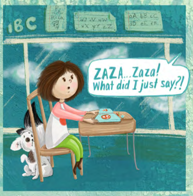
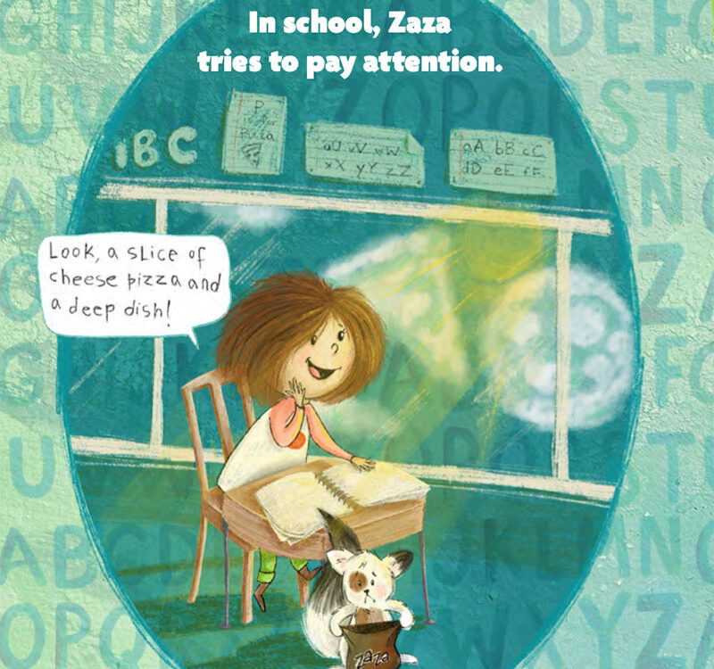
Since Zaza is a graphic novel, I have both regular text and thought bubbles in the manuscript.
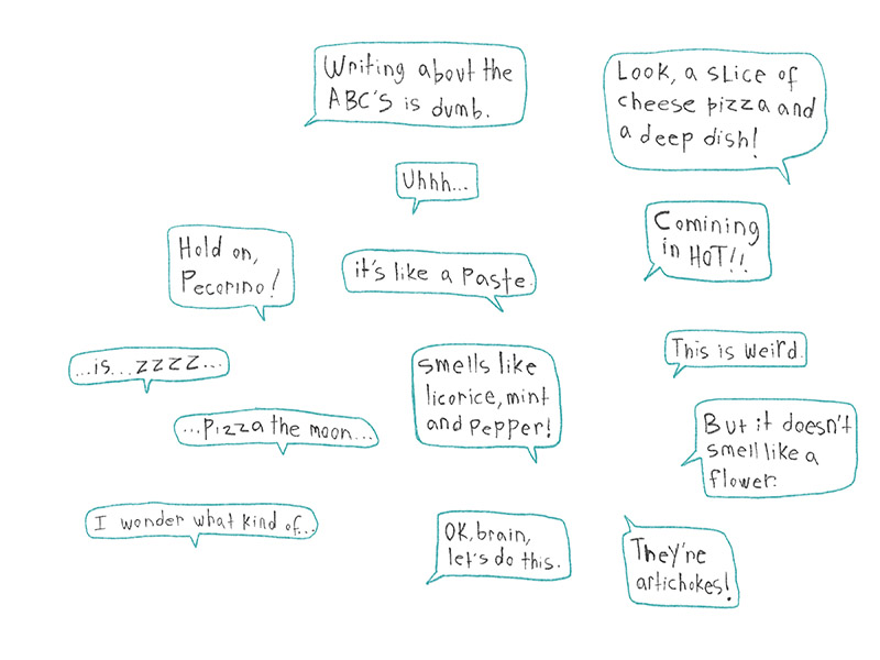
Glutton for punishment that I am, I wanted the fonts for these thought bubbles to be my own writing, so I hand-wrote each of them for Zaza, Pecorino, and Zaza’s teacher.
In addition, I wanted the fonts for Zaza, Pecorino and Zaza’s teacher to each have their own flair, and represent who they each are as individuals and characters.
For Zaza, I use an upper and lower case writing style. Instead of writing right side up, I write her lines upside down! This is actually a skill I developed in my high school Chemistry class. My best friend and I sat across from each other and we spent the entirety of each class writing notes on each other’s books. We got quite good at it, so good, in fact, that it’s still something I can do quite quickly.
This technique has the added benefit of giving Zaza’s word bubbles a child-like flair.
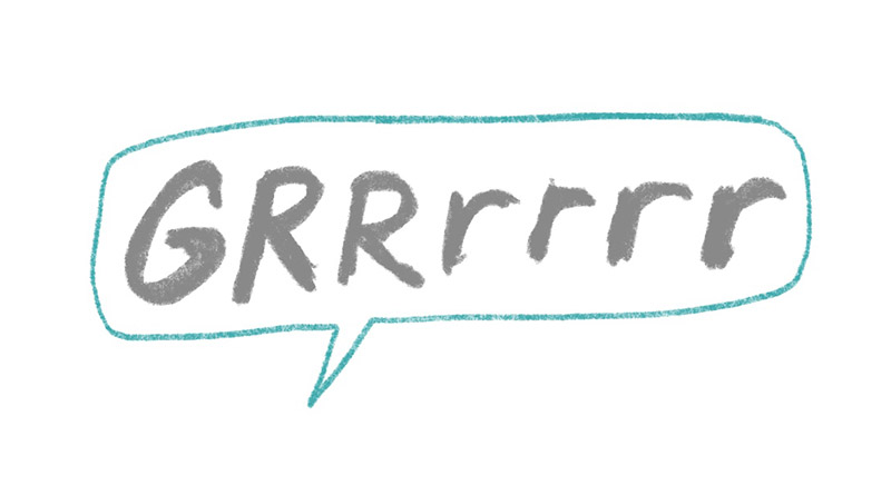
Pecorino doesn’t speak much in this book (and likely never writes…) but it was important to convey his mood along with his speech bubbles, which are usually just dog noises like “Grrrrr”, “yip!” or “sniff!” Unlike some cartoon animals, I have not anthropomorphized Pecorino to speak like a human. I like him being an actual dog and I use that challenge to show his emotions and thoughts with facial expressions and a few noises.
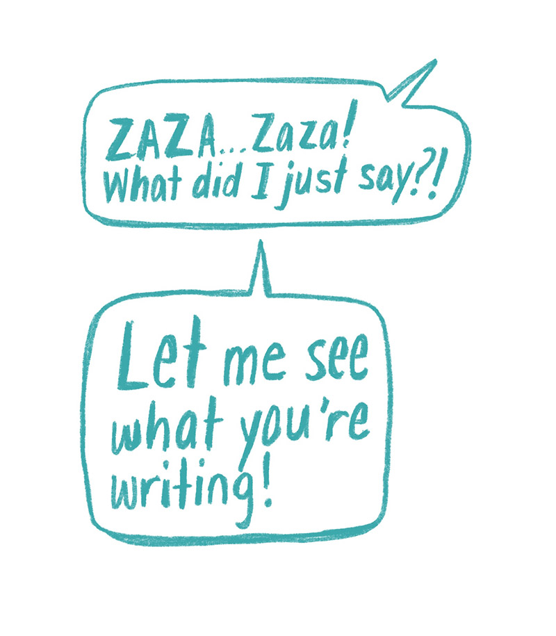
Zaza’s teacher’s word bubbles use a bold and confident font. Since she’s teacher, I thought it was appropriate that she use sentence case properly. I use a thicker pencil width for her font, and I’ve also changed her color to blue (Zaza’s and Pecorino’s are gray) as a point of differentiation.
